Agency Logo
Role
Agency Logo
Year
2024
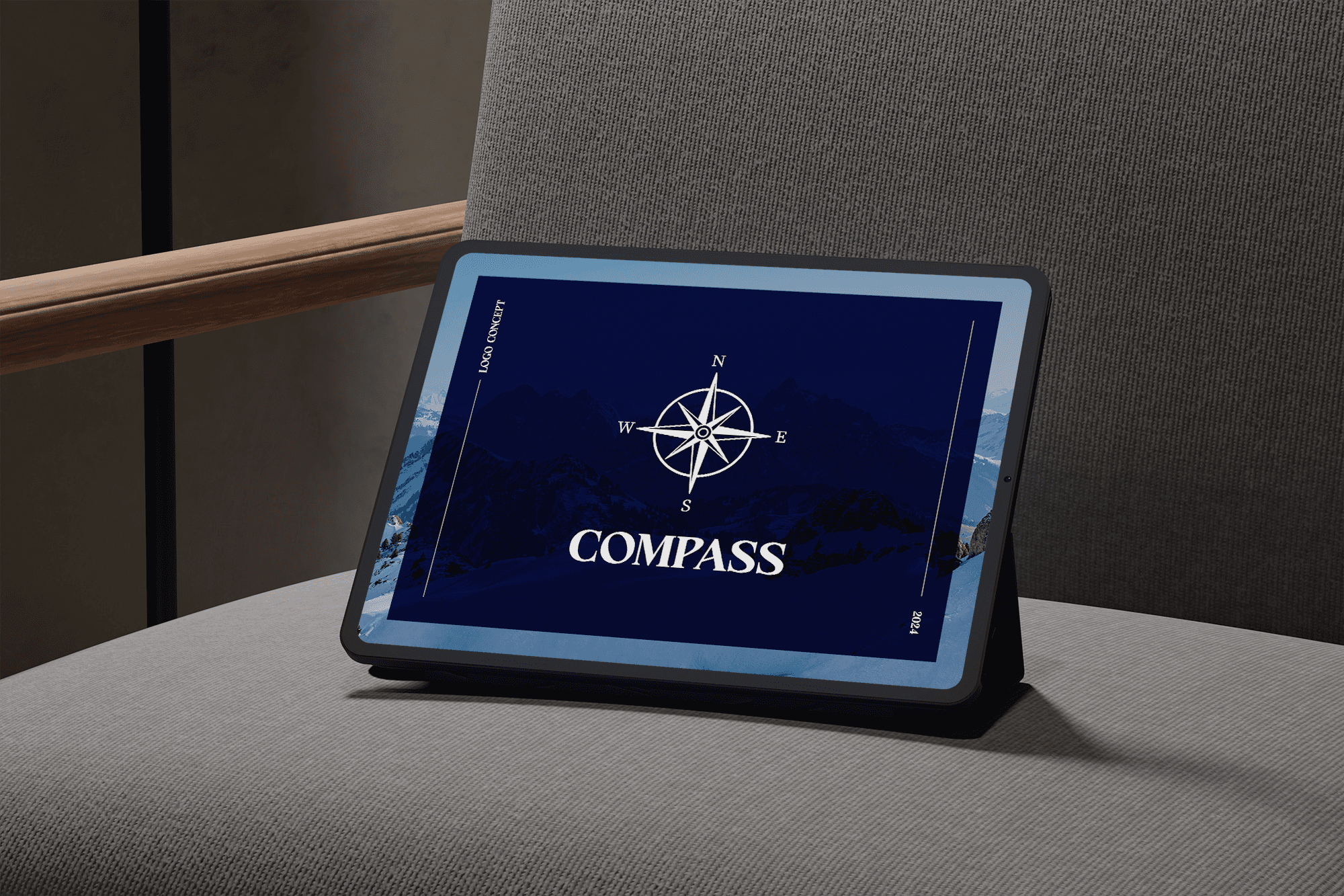
This project centered on creating a distinctive Compass logo for an innovative app designed to guide users through HTA (Health Technology Assessment) regulation. The logo not only serves as a visual identity but also embodies the app's purpose—providing clear, reliable guidance through complex regulatory pathways. Our design reflects the app’s commitment to supporting users with precision, trust, and expertise.
Note: 'Compass' is a placeholder name used to maintain client confidentiality.
Challenges
The challenge was to design a logo that would resonate with a professional audience navigating the intricate world of HTA regulation. The logo needed to be simple yet authoritative, able to communicate guidance and clarity at a glance, and versatile enough for various digital applications within the app interface.

Solution
We created a streamlined, modern Compass logo with clean, sharp lines and balanced symmetry, symbolizing guidance and direction. A professional typeface was chosen to enhance readability, and subtle detailing was added to ensure the logo conveys trust and expertise. The minimalist design is adaptable, maintaining visual impact whether displayed on a mobile app interface or in broader digital materials.
Results
The Compass logo successfully embodies the app's identity, providing users with a clear symbol of guidance through HTA regulation. Feedback has been positive, with stakeholders appreciating the logo’s simplicity and clarity. Its versatile design allows it to seamlessly fit across various digital touchpoints, reinforcing the app’s mission to simplify complex regulatory processes.

Conclusion
The Compass logo design is a testament to the importance of targeted, meaningful branding. As a symbol of guidance and support, the logo will continue to represent the app’s commitment to helping users navigate the intricacies of HTA regulation with confidence.